Clickuorice Allsorts: How Headlander's look works
Fau utopias and rainbow shepherds
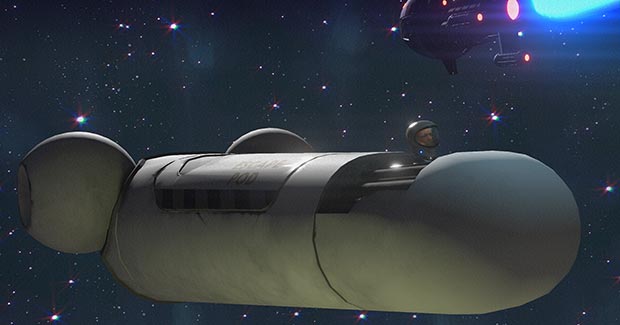
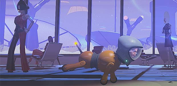
You want to click on a thing that's interesting to read RIGHT NOW? This Clickuorice Allsort is a beautiful-looking confection in the form of the art direction document for Double Fine's head-swappy Metroidvania, Headlander! Writer and director, Lee Petty, lays out things like the game's influences, and why particular stylistic choices were made - the use of the colour spectrum to accompany progress through levels, so red and orange for early on and blue/violet for later - BUT it also has all these explicit reminders to the team not to fall into common traps of the trade, like mistaking visual unity for uniformity. If you're interested in art OR design OR Headlander OR all three there's loads to pick through and enjoy here.
We'll try to build up a bag of these Clickuorice Allsorts so you can dive in for an interesting nibble whenever you fancy...


