Steam unveils its upcoming, very familiar-looking library redesign
Valve's fresh summer look ain't so fresh


Time weathers even the strongest of stone, and not even Valve Time can prevent change. In today's official Steam blog post, we get our first official peek at their soon-to-be overhauled Steam library, along with a few tips on what developers can do to make their pages look nicer under the new design. A public beta of the new layout is due in the next few weeks, and Valve are encouraging creators to start uploading assets for their store page revamp ASAP, starting now. Personally, I I'll miss the old utilitarian design. The new look is perhaps a bit too similar to other big stores.
As juggling a half-dozen different launchers is a necessity for this job, it's a bit of a pity to see Steam's new look is the exact same virtual box-art display with a side-bar that most other shops use. GOG Galaxy, Origin, Uplay, Epic and even the new Xbox Game Pass launcher all have fundamentally similar looks. It seems that Valve's intent is for each game's page to be backed with a nice piece of concept art, with a floating logo that scales independently of the banner. It's a decent, potentially future-proofed look, but I'm predicting that many older games will never update.
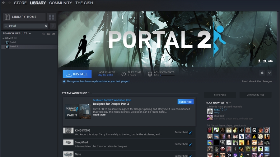
The question I'd like for Valve to answer is what game pages will look like if they don't update to the new system? My first guess would be that they'll use (as is used now) a random screenshot to fill the top art banner. That occasionally looks a bit weird even now, thanks to some odd screenshot pics (or ones lifted from your own snaps), but has the potential to appear even stranger if just displayed entirely unfiltered. Time will tell. Judging by this video from YouTube channel Valve News Network, developers will also have to upload new box art to replace to horizontal 'capsules' currently used.
There's no hard date on when the public beta of the new library view launches, but Valve say "We are weeks away". Personally, I'm expecting a slow, messy and occasionally ugly transition to the new layouts. Indies, if you've got a game up on Steam, you might want to get ahead of that curve. You can see the image sizes and formats needed on the Steam blog here.